I haven’t posted here in ages. I’ve been very busy making sure that DrinkAndDrawMtl.com remains active and I’ve neglected my own blog. So I have a whole bunch of old paintings I need to post because I never shared them here but I decided to get started with with this painting I finished this morning.
I’ve had this thumbnail in my sketchbook forever but this week I saw the cover for The language of knives and I knew my skull had to be partially submerged in water. So I pulled out a big pot of water, my photoflood and my mi-light color changing led and started shooting references. While I was there, I shot every angle I could think of. I have 153 photos of a plastic skull in a pot of water.
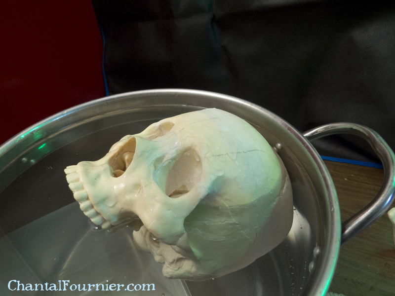
Yep, skull in cold water.
Then I did a montage of the composition I wanted.
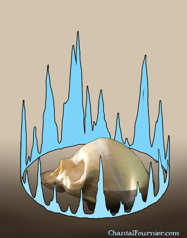
Montage in photoshop. I used the pot as a reference for the perspective on the circle.
I transfered the drawing to my board. I used some darkish mdf that was prepped with 2-3 coats of matte medium. For the transfer, I print my design in black and white using my laser printer. Then I use a sheet of tracing paper coated with vine charcoal on one side as a carbon paper. I always reuse the same, and add charcoal as needed. I also have one with white conte on it which works fine.
Then I started painting my gradients and darks with raw umber, a very transparent pigment. I still dilute it with medium and a small amount of water. I work in a LOT of layers.
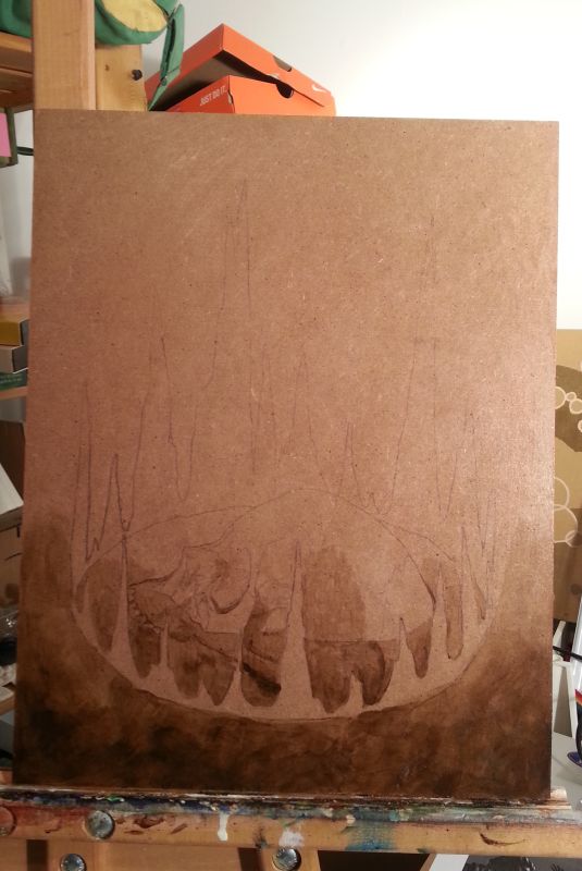
I started with the gradient and the darkest darks. I work so transparent that I’ll need to build those darks in at least 8 coats. Also, that lets me define the drawing for when the lines are no longer visible.
Then a bit of unbleached titanium, to give me an idea of the value range.
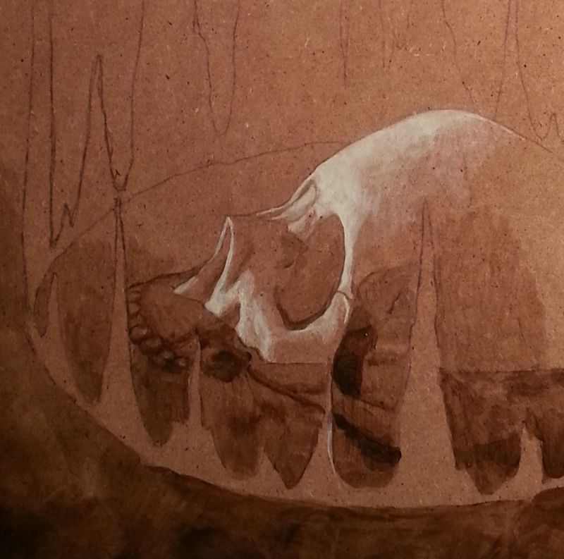
Detail of the light side. Unbleached titanium is a creamy pigment that doesn’t look jarring next to the subdied browns and beiges.
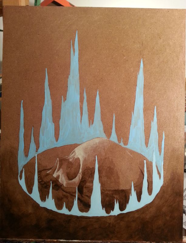
Circle of power, coat 1 has been painted. It’s a mix of white and blue that gives very flat results.
I kept working on the darks. At some point, I started adding some transparent blue (Createx fluorescent blue) it’s very liquid and easy to spread thin. It also mixes very well with the Createx white I use for flat colors, such as the circle of power.
My last touches were a mix of unbleached titanium and white Createx for the tiny specular highlights on the water edges and to show off the wetness of the skull.

That’s it! More darks, more subtle blue, more coats on the circle of power. Just needs 4-5 coats of varnish.
Then I framed it. I had bought this board with a frame I had and the match was perfect.
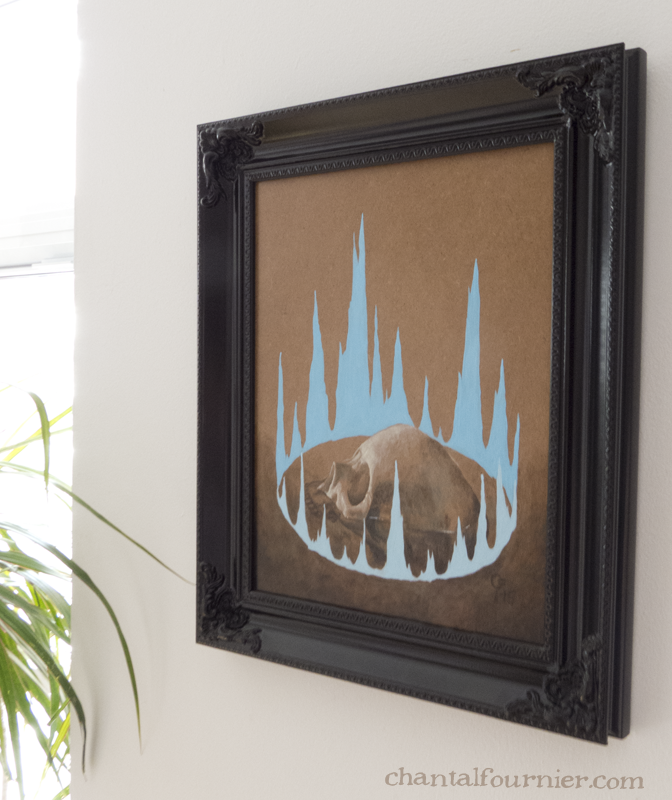
Framed and hung.
Of, and this thing wasn’t meant to be a piece of blacklight deco, but it happens to shine under blacklight, it just looks a bit weird when it does.
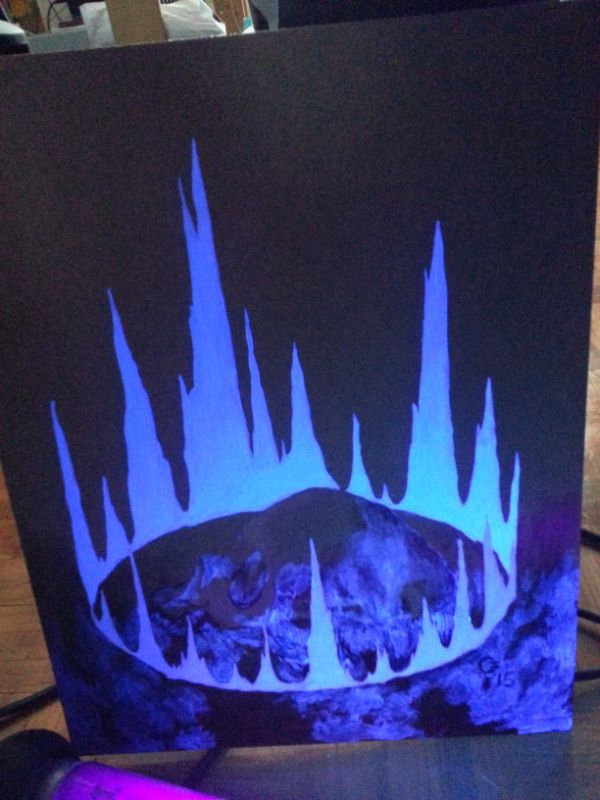
Blacklight! Everything that glows has some of the blue paint on it. It’s a lot more subtle under regular light.
So that’s it. This piece is for sale. I’m asking 220$ for it. Contact me for more info.


